Over the weekend I decided to write up a quick example of form validation in jQuery Mobile. Obviously there are many ways you can accomplish this and I just wanted to take my own little spin with it. Here's what I came up with and I'd love to hear how other jQuery Mobile users are doing validation.
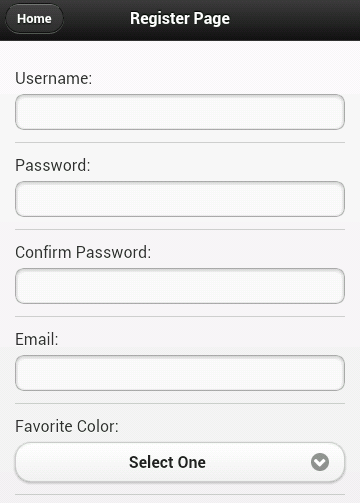
Let's start off with a real simple jQM site. It will have a home page with links to two sub pages. My form will be on the second page. To be honest, I could have just built a one page site, but I wanted something with a trivial bit of navigation to it so it felt just a bit more realistic. I won't bore you with all the code (you can view source on the demo yourself), but here is our simple form:
The form consists of 6 fields: username, password, the password confirmation, your favorite color, and your home town. The validation rules should be:
- Everything but the home town is required.
- Username, password, and the confirmation must be 5 characters minimum.
- The password confirmation must match the password.
Pretty simple, right? Without any validation at all, you can take this for a spin here:
And if you don't want to bother with that - a quick screen shot (which I generated from Adobe Shadow thank you very much):

Ok, so let's talk validation. It would certainly be cool if we could just use HTML5 form validation, right? I mean, look at the mobile browser support for Canvas:
That's a hell of a lot of green. So obviously - if there is that much support for canvas, which is only mildly useful in practical matters - surely there is even higher support for form validation, something we probably all use every single day.
sigh
Ok, so moving on from that, let's talk options. Obviously we can roll our own JavaScript. It isn't terribly difficult to do so. But I thought it might be nice try the jQuery Validation plugin. I've blogged on it before (see links at the bottom) and I liked how simple it made things. I thought I'd give it a shot here and see how it ran.
The plugin provides two main ways of adding validation to a form. You can either add items to a class attribute of your form or supply a list of validation rules when initializing the plugin. Personally, I don't know which I prefer. I wish the plugin made use of a data-attribute instead of a class, but I like seeing my rules in the HTML. I went with that approach but just keep in mind you have the other option as well.
Here's the updated HTML for the register page (just the form bits):
Notice the addition of class="required" to my fields requiring validation. Also note the minlength of the first three fields. This is - pretty much - all it takes. The one big obvious piece missing is the "confirmation must match password" field but that can be handled in a custom rule. I also had to initialize the validation but that's one line of code: $("#registerForm").validate();
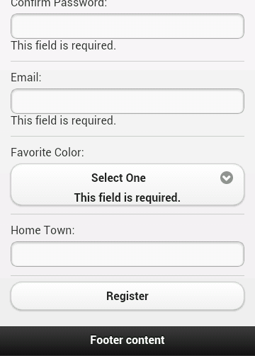
So far so good, right? But check out the result:

First, the errors don't really stand out and second - note the error for the drop down. It's actually inside the custom jQM drop down field. Not good. Let's tackle the design first. By default, the validation plugin will use an error class for displaying errors. That means it is pretty trivial to make it look a bit nicer:
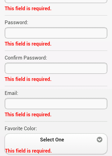
Which results in:

Nice. About halfway there. You can demo this version here: Round 2
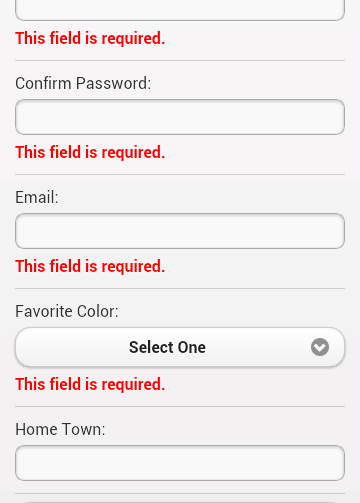
So what about the weird drop down behavior? We can use another feature of the plugin to handle that. You can use a property, errorPlacement, that allows you to dynamically determine where errors should be written out. While we're at it, we can also go ahead and create the custom rule for password matching.
To be honest, the use of .parent() there was a bit of a guess, but it worked on first try. In case you're curious, to add the custom validation to the second password field I just had to add the name to the class list: class="required passmatch".

You can demo this version here: Round 3
So, what do you think? I'd like to work on this a bit more. On the iPad, the errors are left aligned under the labels, which is kinda cool, but I could also see them being aligned with the fields instead. On desktop it is way off but I kinda figure that is an edge case and not something I'd have to worry about. As always, comments and critiques are welcome.